Is the meteorological community able to convey critical weather information to the colorblind?
A panel discussion at the American Meteorological Society Conference for Broadcast Meteorologists in Raleigh last week, discussed the need for more inclusive weather presentation for the colorblind. This short article will look at how the colorblind perceive our weather information and offer some guidance on how we can do a better job informing our audience with critical weather information.
What is colorblindness anyway?
The human eye sees by light stimulating the retina (a neuro-membrane lining the inside back of the eye). The retina is made up of what are called Rods and Cones. The rods, located in the peripheral retina, give us our night vision, but can not distinguish color. Cones, located in the center of the retina (called the macula), are not much good at night but do let us perceive color during daylight conditions.
The cones, each contain a light sensitive pigment which is sensitive over a range of wavelengths (each visible color is a different wavelength from approximately 400 to 700 nm). Genes contain the coding instructions for these pigments, and if the coding instructions are wrong, then the wrong pigments will be produced, and the cones will be sensitive to different wavelengths of light (resulting in a color deficiency). The colors that we see are completely dependent on the sensitivity ranges of those pigments.
Many people think anyone labeled as “colorblind” only sees black and white – like watching a black and white movie or television. This is a big misconception and not true. It is extremely rare to be totally color blind (monochromasy – complete absence of any color sensation). There are many different types and degrees of colorblindness – more correctly called color vision deficiencies.
People with normal cones and light-sensitive pigment (trichromasy) are able to see all the different colors and subtle mixtures of them by using cones sensitive to one of three wavelength of light – red, green, and blue. A mild color deficiency is present when one or more of the three cones light-sensitive pigments are not quite right and their peak sensitivity is shifted (anomalous trichromasy – includes protanomaly and deuteranomaly). A more severe color deficiency is present when one or more of the cones light-sensitive pigments is really wrong (dichromasy – includes protanopia and deuteranopia).
5% to 8% (depending on the study you quote) of the men and 0.5% of the women of the world are born colorblind. That’s as high as one out of twelve men and one out of two hundred women. I am going to limit this discussion to protans (red weak) and deutans (green weak) because they make up 99% of this group. (Source: Colorblind Home Page)
Colorblindness and the Weather
First, it is astonishing to find that very little research has been devoted to this specific area. Some research has been done by NOAA in the use of special graphics that will accommodate the colorblind, but academia has largely ignored the topic. Hopefully this article will energize the topic as it affects so many.
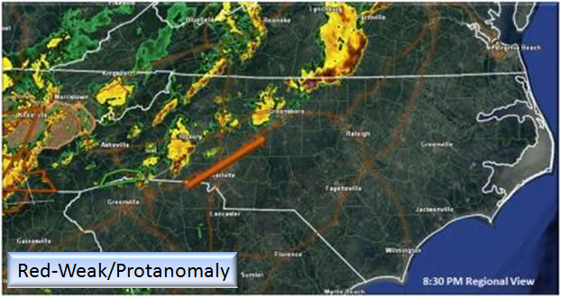
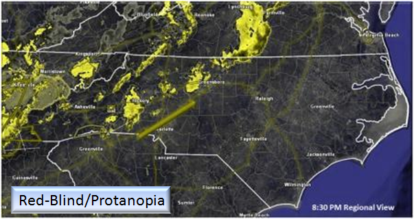
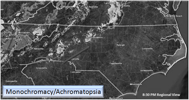
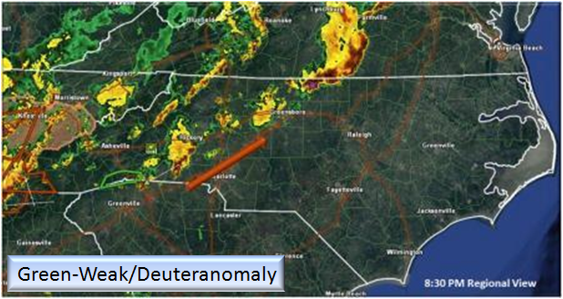
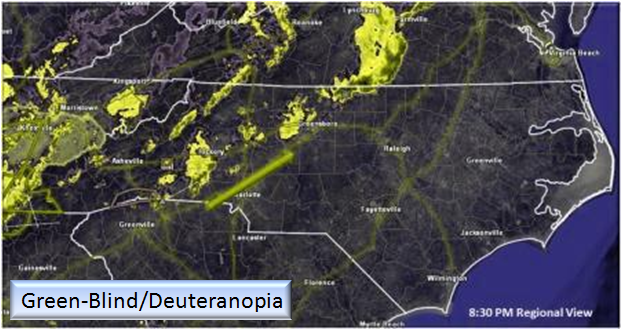
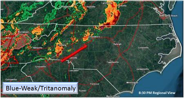
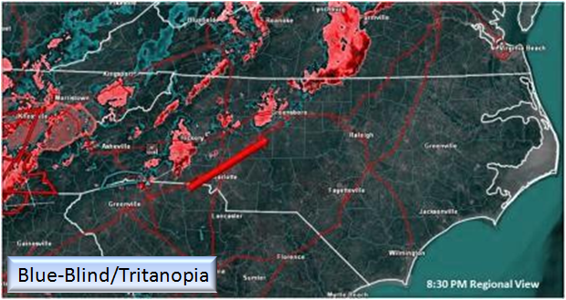
Using a standard RADAR graphic and a color filter, we can approximate what is seen and perceived.
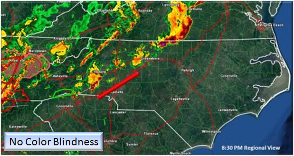
This graphic is what is perceived by 90% of the population. In this graphic, we see an approaching line of thunderstorms with a red arrow indicating the movement. Note in the far west of the image, the thunderstorm Watch and Warning boxes as well as a green Flash Flood Warning box on the NC/SC line. For the majority, this graphic is well received and understood.
Let’s see how the same image is perceived by the colorblind…

NOAA and Colorblindness:
In meeting certain guidelines for web access with the disabled (Section 508 Compliance), NOAA offers one page dedicated to Colorblindness.
http://www.nws.noaa.gov/sec508/htm/colorblind.htm
This clearly indicates the lack of information on this topic and that much more research/discussion needs to be made. NOAA does offer some solutions available from third-party developers that can be used.
- Visolve – Assistive software for the colorblind. This software can be downloaded for free and can be used on any website or local program.
Some Guidelines and Tools for the Meteorologist:
Colblinder : Any weather graphic can be uploaded and checked for readability. It is especially important to note (as shown in the images above) that the graphic designer needs to emphasize the relevant information. Some other suggestions include:
- Avoid the following color combinations, which are especially hard on color blind people: Green & Red; Green & Brown; Blue & Purple; Green & Blue; Light Green & Yellow; Blue & Grey; Green & Grey; Green & Black
- Make it monochrome: Using various shades of a single color instead of multiple colors is of course the most surefire way to avoid color blindness issues. Today minimalism is all the rage, isn’t it?
- Use high contrast: Color blind people can still perceive contrast, as well as differences in hue, saturation and brightness. Use these to your advantage (Hint: many color blind individuals report being able to better distinguish between bright colors rather than dim ones, which tend to blur into one another)
- Use thicker lines: Some mildly color blind people are able to see a color, but only if there’s a sufficient “mass” of it. If a line of color is too thin, it won’t show up as the right color.
- Don’t assume colors will signal emotions in and of themselves: If you’re using red to signal “bad,” “warning,” or “watch out,” consider adding another symbolic element to get the point across to color blind viewers.
- Use texture instead: in maps and infographics, try using texture in addition to color to differentiate between objects.
Source: “Why all designers need to understand colorblindness”
RADAR presentation output has a predefined color ramp (usually from the source). What can we do?
- We can show a scale with a verbose description of the ramp (Light rain – Heavy Rain). This way the viewer has something to help discern the color they perceive and its meaning in order to make personal safety decisions accordingly.
- If we do have the ability to customize the color tables (Gibson Ridge products) then we can reach everyone. Now, will it look pretty? Probably not…just remember it’s all about the data!
RED Means Warning! (or does it?)
In nature, color can mean different things. Red could be either a warning OR indicate a food source. Perception is everything and as we learn more about the technology we use, we must center our focus on the audience we serve and sometimes that means using graphics that people are not used to seeing. We need to better understand how our information is being perceived in order to more effectively communicate our ideas and information.
Moving forward, NC Weather Happens will be making a concerted effort to generate graphics or provide graphic alternatives so that all may enjoy our weather.
NC Weather Happens. Enjoy it!
Be sure to get articles like this in your email by subscribing at ncwxhappens.com…its Free, No ads, and No spam but more importantly, No delay! We are also on Twitter @ncwxhappens.
If you are interested in advertising on this high volume webpage, please send us a note and we’ll send you some information.